Color Spaces
Colors are more interesting than you might think. I want to share a bit of information on colors so that you can pick better ones.
RGB
Most programmers should already be familiar with RGB. When you have a hex code
like #e395fa, that's an RGB value. Displays are made of pixels
which can simultaneously display red, green, and blue lights. The hex code
tells us how much of each color to use, using a two-digit hexadecimal number.
This format is common because it maps directly to what is displayed on the
screen, so most other color spaces need to be converted to RGB eventually.
HSL
RGB, despite its necessity, is pretty hard to intuitively understand. I gave
the example of #e395fa earlier, but it's difficult to imagine what that color
actually looks like (it's lavender-ish). HSL is a 1-1 mapping of RGB, meaning
that each HSL value maps to a different RGB value. And it's in a form that is
pretty intutive. H stands for hue, and is measured in degrees. It points to a
specific color on the color wheel. 0° is red, 180° is turquoise, 270° is
purple, and so on. S stands for saturation, which refers to the strength of the
color. Lower saturations mean that the color will be less colorful, and look
more gray-ish. L stands for lightness. Whiter colors will have higher
lightness, and blacker colors will have lower lightness.
LAB
The problem with HSL is that is is not perceptually uniform. According to HSL, all of these colors are the same lightness.
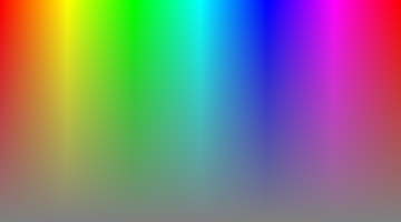
LAB, otherwise known as CIELAB, was designed by the International Commission of Illumination to be more perceptually uniform. L, once again, stands for lightness, and is on a scale of zero to one. A and B don't stand for anything, don't have any bounds, and can in fact be negative. A is the spectrum between red and green, and B is the spectrum between blue and yellow.
LAB still isn't perfect. The most notable problem is known as hue shift. As the color gets lighter, the color starts somehow shifting towards purple.
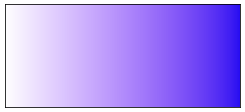
But all is saved, because one day Björn Ottosson said, "let there be OKLAB". OKLAB was first described in a blog post he made. It's called OKLAB, because he thought it was just okay1. Clearly he was wrong, because it didn't take long for OKLAB to become widely available in Photoshop, web browsers, and game engines. It's not perfect, and it's not even always better than CIELAB2, but it's good enough to beat everything else that's out there.
OKLCH
I don't think you need me to tell you that LAB is hard to visualize. Just guess
what oklab(0.78 0.12 -0.11) is. So, OKLCH came in. It's very
similar to HSL. H and L still stand for hue and lightness, respectively. C
stands for chroma, which is technically different from saturation, but similar
enough that I just think of them as the same thing.
One big difference between OKLCH and HSL is that OKLCH doesn't recognize every color as being valid. Some colors are simply impossible. Try imagining a green that's as dark as black, but still clearly green. And there are colors which exist but cannot be displayed by your monitor, like the brightness of the sun. OKLCH doesn't attempt to represent them. You can clamp them down to a color from the sRGB color space if you wish, but there are colors in OKLCH that cannot be displayed by your monitor, or any monitor for that matter.
I think it's better this way. Some designers may decide to clamp the color into sRGB anyway, but it's good to at least know that the selected color value doesn't quite match reality. And on the bright side, it might become slightly easier to support HDR displays.
If you want to play around with OKLCH, there's a convenient URL for oklch.com. I recommend giving it a try, and thinking about it the next time you need a set of colors for your project.